Most academic posters are terrible. There, I said it, and feel better for having done so. So much can go wrong. The text, the graphs, the pt9 font size and a design-by-committee approach running through everything in sight. I remember in-person conferences when I would walk through the poster section full of confusion and wondering ‘what did they do?’ ‘what’s that one even about?’ and ‘what’s in this pastry?’.
Maybe I’m being a little unfair, academic posters (and non-specific pastries) serve a good purpose. But I can’t help but think that there is a missed opportunity because research can extend beyond academia and help to improve people’s lives often helping some of the most vulnerable and stigmatised people in society.
Conference posters are a great way to develop science communication skills and to produce posters that appeal to non-specialists and to people who don’t yet know why they should care.
Therefore we (at the SSA) have developed this guide to making an academic poster. These items may, or may not, bear a passing resemblance to the judging criteria that will be used at this year’s SSA conference. Just saying.
Know your audience
This is the first and foremost rule of science communication. It seems obvious, right? Your poster is for people going to the conference. But no, even within this small audience there are differences. If you are trying to get the attention of a single professor, then find out how they like their posters and design it like that. If they love p-values then cram them in, if they like purple, then that’s your colour-scheme. Actually, you could really personalise things and just put their name in capital letters along with your contact number below alongside a deterringly eager “call me”.
If, however, you want your poster on (say) MRI scanning to gain the attention of the MRI crowd, then use an image of the latest and most exciting MRI scanner. If you want to connect with qualitative researchers, then include quotes, if you want to mix with quantitative researchers, use graphs and charts. Pictures of machines, graphs, quotes and people, the balance will change depending on who you want to impress. Every time you consider ‘doing’ science communication ask the question, ‘who is it for?’.
Presentation
Less is more. Even less is even more. More is a mess. Less mess is best. Whilst not the best mnemonic I’ve ever used to open a paragraph, it just about makes my point. When writing academic articles most people will gather 10,000 words or more and edit down until they end up with just the bare minimum required to tell the story. The same approach is rarely used for posters where – like a tragedy of the commons – you can always add more text, but by doing so edge the poster closer to a pt9 cliff edge.
When was the last time you saw a poster of any kind (outside of an academic conference) with 2,000 words on it? Never, and if you have I want to know more. So, decide on your key messages – three maximum – and make those messages stand out.
To avoid any confusion, your poster still needs words. It needs way more words than anyone in advertising would consider even remotely acceptable. To paraphrase many others before me: the word limit is, as many words as are absolutely necessary to tell the story, but not a single one more.
Tell a story
I love an academic abstract. But, when you think about it, it’s not how you talk to people usually both inside and out of academia. So sure, follow the abstract format, it works and researchers will know where to look and what you mean. But, also consider telling a story about what you did, why you did it and why it was interesting – like you are actually talking to someone. Tell a story in a logical order and you’re half-way there.
Along with text, make images and graphs uncluttered. Remove all unnecessary distractions so that the viewer can look at it and get the idea. If they are interested in the detail, they can contact you later (and as if by magic, a research collaboration is formed). The point is that they are interested, and that their mind has stopped drifting towards their unease about the ingredients of what they now cautiously presume to be a ‘sausage roll’.
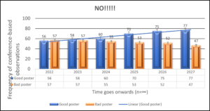
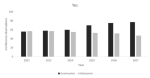
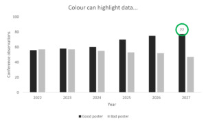
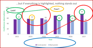
I’m probably not the best person to give advice on colour; to me, everything beyond monochrome seems unnecessarily fussy and verging on the psychedelic*. That said, colour can be a useful tool to highlight elements of your poster. Remember, you cannot highlight everything, so use colour sparingly. It is also worth noting that colours look different to people who are colour blind. You can test out your poster using webpages like this one.
*Although, I’m not judging the posters, so perhaps take my views on this with a pinch of Pantone 11-1302 TPG.
Topic
What is interesting or innovative about your research? Make this prominent. Are you using an innovative sample, an innovative recruitment technique? Do your participants come from a population that’s often overlooked? Are you using an interesting method? Are your results fascinating? The point is, if you are doing something novel, then highlight this. It will draw people in. Perhaps make it the title of the poster – get the message out there front and centre.
Accessibility
Most posters are designed for your supervisor or project lead’s approval. But, no matter how amazing they are, that person is not your target audience (with the exception of the occasional ‘call me’ poster by neglected PhD students trying to arrange supervision). Your target audience may not know your subject area at all. They probably don’t even care what you’ve done unless you can persuade them otherwise (sorry to break it to you like this). Make sure your poster is accessible for all those people you’ve never met.
- Don’t use jargon or acronyms (unless utterly unavoidable – UUU)
- Use plain language (MS Word can now check your readability, you can find it under ‘proofing’)
- Don’t use pt9 text, delete words first, delete charts, remove images, burn the poster if you have to, but whatever you do don’t use pt9 text – unless referring to terms and conditions that you don’t want anyone to read
Instead of looking at your poster and asking yourself if someone without a background in research could understand it, find someone without a background in research and ask them if they can understand it. Their input will probably be far more valuable for developing science communication skills than your supervisor’s.
Inclusion
It’s probably too late to re-do your research (although, it’s never too late), but it is important to build inclusion into your research and into your poster. Have you involved anyone with lived experience of addiction? Have you involved people from marginalised, minority or vulnerable groups? If you have, say so. The more people talk about inclusiveness, the more it will become routinely included in all aspects of research and dissemination.
When you use examples, try to make them examples that will resonate with a wide audience. Not everyone can relate to a yachting metaphor, no matter how illustrative it is. Not everyone has experience in addiction treatment services, so you might need to explain some context if using this as an example. Work hard to avoid excluding people through the examples you use.
If your research has the potential to improve people’s lives, then highlight how it will do this – use colour to do so (if you must). If it doesn’t have that potential, figure out what the benefit is, and highlight this. This is the element of your research that will become impact (that’s for another post). If it’s not already, impact will become something you lose sleep over. You might as well start now.
Entry criteria
Don’t accidentally get your wonderfully minimalist, monochrome, three-word poster excluded because it hasn’t met the entry criteria. This year’s SSA conference (2021) will be online again, and so the criteria has slightly changed. To qualify, the poster must:
- be a maximum of three slides (a fourth slide may be included for conflicts of interest and references only)
- contain a conflict of interest statement, even if it states ‘there is no COI’, either verbally or on the poster
- have an audio voice-over
- not exceed three minutes of speaking (some audio may have three minutes of speaking but a longer recording time e.g., 3.24 mins – this is fine)
Academic posters are an opportunity to be creative and to develop science communication skills. They also present a good opportunity to get feedback from your peers. So make sure you have a look at the other posters during the day. There is some amazing research going on, and these posters will showcase the work of some of the smartest people in the field (as well as some of the most questionable design choices).
by Rob Calder
The opinions expressed in this post reflect the views of the author(s) and do not necessarily represent the opinions or official positions of the SSA.
The SSA does not endorse or guarantee the accuracy of the information in external sources or links and accepts no responsibility or liability for any consequences arising from the use of such information.